Yesterday, via their blog, the BBC announced a beta testing of new BBC homepage design, so I checked it out and… I like it.
This redesign is big news, for 2 reasons:
- The BBC is a huge media giant, not just in the UK but worldwide too
- As a UK TV licence payer and a regular user of the BBC website, I have a vested interest in it.
Is the design any good?
According to Adactio, the design is very web 2.0 with many irritating visual design elements, although I think that’s true, I also think that to non-web professionals, those cliched web 2.0 design elements aren’t cliched (yet) – after all most people are used to using Facebook, and the BBC – sites that don’t offer these features in abundance.
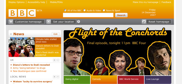
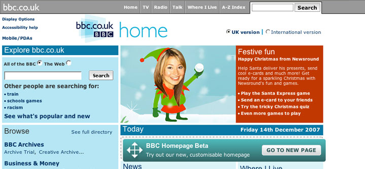
My only gripe, is that the colour scheme is too blue (my screenshot shows an orange colour but the default colour is blue) – that’s a personal preference and so should be ignored. Even though I dislike the blue, it is a massive improvement over the current homepage’s (over)use of wishy-washy blue (see screenshot below).
Fantastic findability, useful features
The good thing about the new design, is that it seems to be very easy to tell where all my favourite content is located. It also contains Television and radio listings for the day, something, which is sorely missing from the current homepage.
The fact that elements can be hidden and moved around, in a similar way to iGoogle is either brilliant or useless – I’ve yet to decide. I go to the BBC website for football (soccer) news and TV/radio listings, sometimes the weather and sometimes the news so maybe it will be useful for me to be able to move those things towards the top of the screen and hide the information I never look for.
A bigger, wider design
This design sees the BBC taking up a whopping 982px in width – and why not? People’s monitor sizes have increased. The majority of people skiving work in British offices by reading the BBC website will have decent sized monitors with fully-maximised browser windows. So they can handle more width.
I’m sure there will be the usual people claiming that this website should be liquid (get wider or thinner depending on each user’s screen) and that this 982px width will cause horizontal scrollbars for the (tiny minority of) people who have resized their browsers to accommodate smaller websites – but they can be safely ignored.
Summary
For me, the design reminds me of cnn.com – which is no bad thing. I think the BBC has put usability and usefulness ahead of a desire to make the website visually stunning and it this kind of thought process which can create a great design.
Its a very bold move. I’m not a big fan of the gradients but other than that its okay. I actually preferred the older design though.
On reflection, it’s very difficult to assess a new web design by its new homepage. After all, a homepage’s purpose is to get people to the content they want as quickly as possible. From that perspective, this new BBC design is very good.
The very fact that so many people dislike it, could be a good sign.