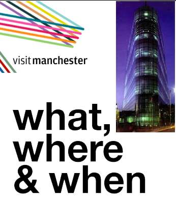
I live in Manchester, and I absolutely love it. I think it’s so great that loads of people should come and visit to see the city’s sights. So why does Manchester’s new tourism website visitmanchester.com not impress me in the slightest?
a Non-design
 My first complaint is the actual look and feel of the site. It feels to me as though it has been jumbled together. Manchester has recently had a new logo commissioned that, although not to everyone’s tastes, deserves more of a billing in the header graphic of the website.
My main problem with the design is the poor use of undecorated black text for links. It baffles me why people try to disguise links on a website when links are the advantage of the web.
When the user, actually moves away from the homepage to a subsection of the site say food & drink the design changes for the better (slightly) but not enough to warrant any interest.
URL structure
I love clean urls. I can’t seem understand why a web developer wouldn’t put in that extra (tiny) effort to make URLs clean and understandable. Ok, most users don’t check the address bar but if they do glance up there, for god’s sake give them something useful.
If they see http://www.visitmanchester.com/foodanddrink/ in their address bar it’s pretty obvious they’re looking at the food and drink section of the website. Whereas if they encounter http://www.visitmanchester.com/experience.aspx?experienceid=7 what does that tell them?
SEO
Nice // Visit Manchester / Homepage // helping anyone? It’s looks silly in Google and gives screen reader users a headache.
.Net .D’oh!
A close inspection to the code reveals the use of .Net as the development environment. For me, that explains it all.
Microsoft’s .Net is the web’s greatest criminal. Much more so than Microsoft Frontpage because Frontpage is the tool of the amateur; .Net is the tool of the divbot charging hundreds of thousands of pounds for websites worth 10% of that.
Summary
This website isn’t terrible but it is mediocre. What angers me is the the fact that the taxpayer has paid for this and I don’t think it will encourage anyone to visit this wondrous city.
Hi Phil
Just stumbled across your article. I manage the development of visitmanchester.com so I was very interested about your views.
With regards to the new logo, I would have loved to use it to it’s full potential but due to bureaucratic constraints I could only use a limited version.
I agree with your points about link colour, url structure and seo and it’s something I’m in the process of reviewing with the development company. Hopefully if you re-visit the site in a few weeks you’ll see some positive changes.
Thanks
Stuart
I’ll look forward to the changes.
Also, thanks for taking my criticism so well.