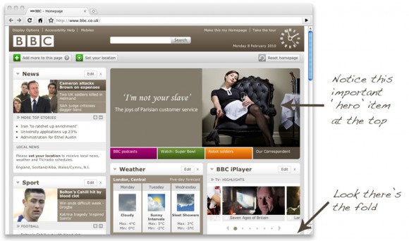
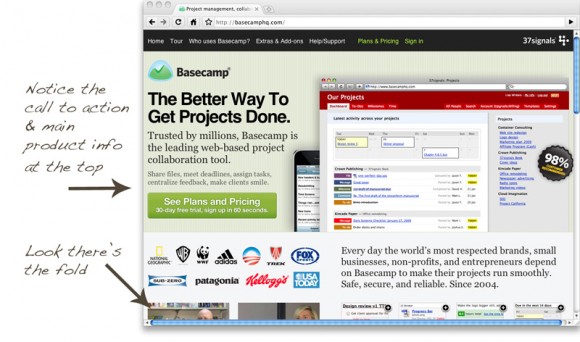
‘There’s no fold! There’s no fold!’ cried the web designer. Well, I’ve got news for you pal: of course, there’s a fold.
What’s the fold?
The fold is an old media term used to talk about the content that is above the physical fold on a broadsheet newspaper’s front page. On a website, the fold is traditionally the point at which most people’s browser stops before they have to scroll to view the rest of the content.
This analogy may sound a bit weak and old hat but it is actually very strong because just as the content above the fold on the newspaper draws in potential readers who will pick up said paper from the newsagent shelf and unfold it to read the rest so to does the ‘above the fold’ content on a website encourage the user to click-through to the next page or scroll down to the bottom and read all the content.

But nobody scrolls
You’ve probably come across inexperienced clients who think users won’t/don’t scroll and that all their content should be above the fold. The problem here is not that ‘there is no fold’ it’s that the client doesn’t understand what their most important content is.
Users scroll everyday in Microsoft Word, Excel and their email clients. They scroll down on BBC news pages all day long; to put it short they expect to scroll to find the content that they need.
So what’s the point
Content is king, and the most important content should be at the top so as to draw the user’s attention; auxiliary content should follow after it and your design should inform the user that they can scroll to see more content.

Part of your job is client education
The next time your client wants the entire kitchen sink placed ‘above the fold’; it’s your job to help them work out which of their content is the most important (to their customers); what is the primary goal for that page and then explain to them that this primary content needs to go towards the top and in view when the website loads – then the supporting content can go below.
Your client won’t complain when the click-through-ratio on their call to action buttons improve once those press releases get moved down the page a wee bit.
You jumped on this before me, I was going to write a very similar article about the existence of ‘the fold’.
It’s all very well everyone shouting about how users know how to scroll but the fact of the matter is, on site that need to sell something or get a point across then what the user sees when they land on the site is obviously the most likely to be clicked on.
The ‘fold’ may be different for different users but is sure as hell exists, in my opinion, and, like you said, it all comes down to education of clients about usability and what is going to be the most successful layout for them.
Thanks for the comment Gareth and thanks also, for making sure your gravatar matched my colour scheme – much appreciated.
I read this post, Life below 600px last week and it’s very good. The author/designer has made the design work very well for the point he is trying to make and it definitely encourages you to scroll and read the full content. However, you wouldn’t want an ecommerce/brochureware site to start with a gigantic 600px header just because it looks good and people may scroll.
For the record, that is not what that author suggests at all but I do get the feeling that some web designers think they can just ignore all the rules for the sake of what they think looks good.
I read that I Am Paddy post as well and thought at the time it went too far against the idea of the fold. It made the point about how newspapers use ‘above the fold’ to grab attention, and then went on to ignore the fact it’s a great idea to be used online as well.
Haha, you’re welcome!
Yea, I read that article too, and while there are valid points but, as always, it all
comes down to what is best for the website and it’s vistors.
You’re kind of right…IMO
There is no fold – people do scroll, but you’re absolutely right in that it’s about priorities and working with a client to find the importance of certain bits of content and have those clearly viewable without scrolling. It’s common sense in some ways – the most important stuff should be seen first.
I get the sense that with many web folk (myself included) that the words or phrases we use that come from print or other media have started to get a bit irksome. They don’t sit as well as they did. Talking about a ‘fold’ doesn’t fit with the model we’re using. Perhaps it did when the web was purely static files but I like to think we’ve moved past that ;)
There’s is no fold but there is work to be done to help clients assess the priorities of their content and the space you see before scrolling is bound to be more important space on a site…