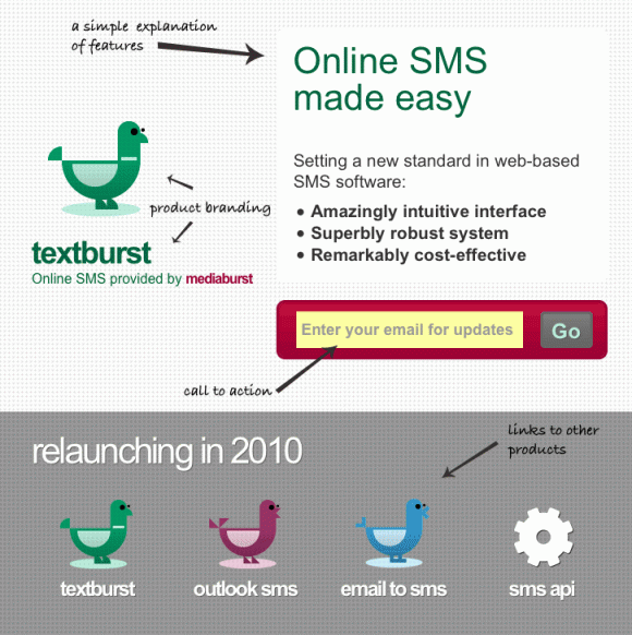
It seems you can’t move for beautifully designed ‘Coming Soon’ pages for web apps on the interwebs these days – so for my latest project I’m getting in on this design trend.
For the last few months I’ve been working on-site at a company called mediaburst redesigning one of their web apps and helping to redesign their website. The company has put a lot of thought into the design for these products/sites but the market they sit in, sending online SMS is a crowded arena so they need something that helps them to stand out from their rivals.
Step forward the achingly trendy teaser page…
At this moment in time, everyone (well, web designers anyway) seem to be fascinated by these coming soon pages, Smashing magazine have posted about how to design them and .NET magazine’s latest issue (December 2009) features a design-off between 3 top designers for coming soon pages.
Where it all started
Brighton web agency, Clearleft started it all with their supercool Silverback holding page; it looked great and it had that cool parallax effect. Those two ingredients were vital in building up a shedload of buzz for their (at the time) unlaunched product.
It is worth pointing out that the Silverback page did trade off the incredible reputation that Clearleft have cultivated over the years but I believe regardless of the Clearleft connection it would have succeeded.
Good design can make great bait
Last week there was quite a bit of buzz surrounding the newly designed teaser page for themoneypig.com when I saw it I thought – hang on a minute, we’ve got a great design and a quirky new branding concept – we could get in on this teaser page trend.
The new mediaburst website and branding has been designed by a combination of Stiff Rowlands (overall design/branding concept), Stanley Chow (illustrations) and myself . The new website and redesigned app won’t be ready for a short while yet so these coming soon pages will hopefully get people excited for the finished product.
Key features of a coming soon page
Without a doubt a teaser page has to feature the following:
- Great design – wow people with aesthetics
- Obvious call to action(s) – grab people’s email addresses
- Succinct copy – explain the product but don’t bore people
- Zeitgeisty feature -Â be it a parallax effect, or a piece of CSS3 or some jquery magic
Key success criteria of a coming soon page
A holding page can be deemed to be successful if it gets:
- featured in design galleries
- talked about on twitter/facebook/etc
- linked/listed in any list post on popular magazine style blogs
If any of those come true then, it’ll hopefully lead to some good SEO results and, even better, a sizeable list of people who are interested in the product the day it goes live.
It’s not necessarily the be all and end all to grab people’s email addresses – obviously the end game is to get customers but it’s also vitally important to get backlinks and to generate interest and discussion around your product.
Your thoughts
What do you think? Are coming soon pages a great way to market a new app or are they a fad that will fade away in 2010?

Definitely useful if you can get a URL re-tweeted to gain interest in an app, although it does seem that everyone is at it, be it a web project or iPhone app!
Before you know it, we will be giving our email address to anyone with the slightest glimmer of an idea!
If the service they are offering is online SMS messaging, why not capture their mobile phone number instead of/as well as their email address? Then you can push out SMS messages when the service is ready which will also promote the quality of the service.
Very good point Scott – this is something that could have easily been done and would have arguably made a lot of sense but we all felt that as this was an online product and so email was the best medium.
Another consideration was trying to keep the form as simple as possible and felt that just allowing one option (email) was the best way forward.
What’s ur zeitgeisty feature then Phil, HTML5 perchance? ;)
Looks good mate, I think people like to feel they are in the know about something or they know some secret that others don’t. You have to figure out what ou’re going to do with those emails though, be it discounts, previews, beta invites whatever there has to be an exchange of information and value.
Admittedly the zeitgeisty features are minimal – I’ve opted for a wee bit of text-shadow with rgba on some of the text, a type attribute value of email on the form and of course that sexy HTML5 doctype.
I contemplated (and experimented with) some css-transitions; feeling that would have been the ultimate way to jump aboard a fad but couldn’t quite get an effect that I liked.