Images are one of the biggest buzzkills for download speeds on the web.
If your designer wants to use a carousel you’re potentially asking your customers to download several HUGE images and wait several seconds before they can interact with your site.
With the following 3 tips you could significantly improve your user’s download speeds and reduce their data bills without impacting the quality of your images. That’s win-win – right?
1 Optimise your images in Photoshop/Illustrator
Images are a killer on the web. We all want images to look crisp but what if we could have great looking images at smaller file sizes.
The biggest mistakes is when designers save images at 100% quality, when something like 75% will not reduce appearance but will dramatically reduce file-size.
Here’s how
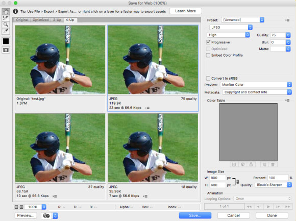
- Trigger Save for Web by pressing Command-Option-Alt-s (on Mac)
- Choose JPEG from the dropdown
- Set Quality to Very High or 75%
- Tick the Progressive box
- Untick the Convert to sRGB box
- Click Save…
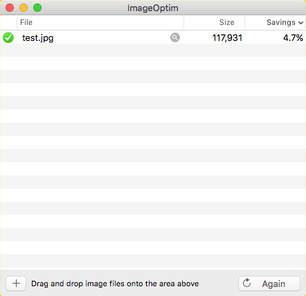
- Finally, run the saved image through an optimisation app like ImageOptim
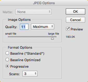
Here’s some screenshots of the process
Option one is to save the image with Photoshop’s default Save As feature. You can optimise it in here but it’s not as obvious what you’re getting.


Use mobile-sized images
Mobile phones are only 300px to 600px wide so why are we sending them the same 1600px wide images that a 1920px wide desktop gets?
With HTML’s new <picture> element, we can now send different sized images to differently sized devices. We can even art direct imagery so your website’s mobile version can get a differently proportioned image and not just a scaled down one.
On a recent project with The Economist, there was a need to display different images at different screen sizes – not just to give user’s on mobile a smaller image to download, but because the design was split into differently sized modules with copy laid on top of images and some call to action buttons laid on top of the image too. The images were 600px high (in the largest module) but as the screen got smaller, the images needed to stay the same height but shrink in width.
As the images in question were cover images for short films it wasn’t good enough to crop the image with CSS and risk a face or important part of the image being out of frame so different images were cropped at different sizes.
Here is a sample of the code used:
Here we can see, that by default, a 312px wide by 600px high image is shown. Any browsers without <picture> support (and for whatever reason no JavaScript support) will get this image. Not the end of the world. We can size this with CSS so it’s full screen – which would make it blurred but it’s not a completely terrible fallback.
Then as the screen gets wider a wider image is displayed. Any screen wider than 321px gets a 471px wide image; anything wider than 471px gets a 632px wide image and anything larger than 632px gets the 961px wide image.
(N.B.The sizes 312px, 471px, 632px and 961px are merely the sizes in the design.)
The reason we set the first rule to be 321px is because an iPhone 5 is 320px wide so it’s a reasonable breakpoint, but more importantly – when the site’s gutters (of 10px either side of the image) are considered, a 312px wide image fits in the layout without any distortion. Each time the screen width becomes greater than the current image width we swap it with a wider image so user’s always get a crisp image.
N.B. The picture element is not 100% supported across all browsers (as always, check caniuse.com for details) so you may need some JavaScript to get it to work. That’s where the picturefill script comes in.
3 Use SVGs
SVG may be a new term to a lot of people but it’s likely your design team is already creating vector graphics as part of their process. Create a logo or icon in Illustrator and saving as a .eps or .ai file makes it automatically a vector. So exporting it as an SVG is super easy.
Little things like using SVGs instead of PNGs/JPGs for icons and logos can go a long way to making your website look slicker.
Sick of maintaining 2x or 3x size images for retina devices? Switching to SVG means you don’t have to anymore – an SVG looks crisp on any device and it’s easy to animate too.
A few years ago, developers would place all their icons inside sprites (i.e. one big image containing smaller images) but this is no longer the optimal approach – SVG is!
You can even optimise SVGs by running them through an app like SVGOMG to remove whitespace and shrink the file-size further.
SVG Sprites
Okay, so sprites haven’t gone away, they still make sense except now we have SVG sprites instead of giant PNGs. Inline SVGs make a lot of sense; you can animate them and manipulate them in many ways, but say you have a table with 30 rows and each row has a delete icon and an edit icon. It would be silly to repeat each SVG 30 times.
The solution is to put all your SVGs in one big SVG file (e.g. a sprite) as <symbol>s and reference your SVG like so:
That’s great but it doesn’t allow browsers to cache the sprite (and therefore have quicker repeated views of your website) and it adds a lot of bloat to the HTML.
Don’t fear help is on the way, because you can simply reference an external SVG file instead of the one inline in HTML. You’d simply edit the <use>‘s xlink:href attribute value to have a full href value like /assets/path/to/sprite.svg#icon-close instead of #icon-close.
External SVG sprites aren’t 100% supported (big surprise) so you may need some JavaScript (again) in the form of a script called SVG4Everybody to get it working in all the (currently) modern browsers.
Summary
Those fixes can be made today and your website’s visitors (users, customers – whatever you call them) will be happier if you use them on your site.
Retweet this article
3 speedy tips to optimise your web images https://t.co/OgdNkO1bcC #front-end #images #optimisation #performance via @imgiseverything
— Phil Thompson (@imgiseverything) March 7, 2016