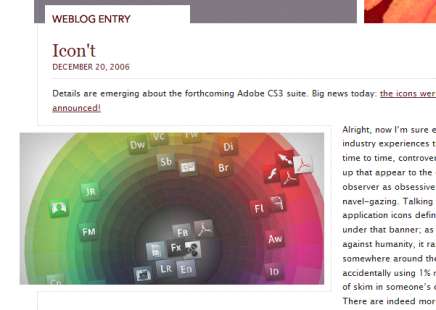
Dave Shea, creator or CSS Zen Garden, has redesigned his personal website, mezzoblue.
At first, I found the results less than satisfying but after a few visits I’ve really started to enjoy this redesign.
This is a design that at first looks simple but ,as you delve into it, it is actually a little more complex. My favourite feature has to be the way the article’s main images seem to be breaking out of the design.

How this has been acheived with CSS
Dave has done this, it seems by applying a background image to the div containing the image and applied a padding/margin to the whole of the page’s containing div to make it the image and other aspects appear as though they are bleeding over the edges.
Nice one Dave, this is a great design.