Google Analytics is good and it’s free so it’s double-plus-good. The things that can be measured include the drop-off rates for your checkout process, revenue by source (e.g. which website has sent you the most money).
Recently at JJB I’ve been taking it a step further by using GA to analyse the problems people are having with our site.
The first measurement I’ve added this week, checks how many people try to add an item to their shopping basket when the product size is out of stock. For this to make sense, you have to realise that our website has a select menu on the product details page where the user selects their desired size and if that size is in stock the add basket button becomes visible as does the select quantity option. When stock is not present the user is told so.

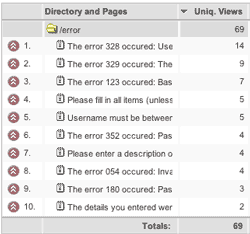
The second and more important measurement, from a usability point of view, is the counting and aggregation of the error messages the users on our website get. To be honest, this information isn’t giving me too big an insight as I am aware of a lot of the problems (thanks to Usability Testing with real people) but they do add weight to my suggestions to change the site in places.
How it’s done
Simply add this code to your page:
<script type="text/javascript">
urchinTracker('error/<?php echo $individual_error_message; ?>');
</script>
This will produce a folder in your content drilldown option in GA called error. N.B. For this to work your errors must be set up in an array so you’d call the above script multiple times in a loop or have multiple calls to the urchinTracker() JavaScript function for each error message otherwise, the data will be difficult to aggregate and therefore read.
It’s still early days for this data but hopefully, it will not only highlight issues I’m aware of but issues that I’m not and it goes to show how you can use Google Analytics to be even more valuable than it already is.
This looks like the sort of site which would be very useful to me – but I can’t read it.
Black text against against a dark grey background is an “Access and Usability” no-no.
Good point Roy. I’ll look into this.
I thought the text was just legible enough although I’ll admit I knew I was taking a risk!