63 Degrees
Manchester’s French Restaurant 63 Degrees, recently upgraded to grander premises in the heart of Manchester’s Northern Quarter; so they needed a fully responsive WordPress website that showed off their food as much as their new surroundings.
In 2012 (in collaboration with HG5 Creative) Phil built the original WordPress website for 63 Degrees but a lot changes on the web in 3 years and this time there was more of an emphasis on mobile and performance after Google Analytics was inspected Phil noticed that the share of users was close to 50% for mobile/tablet devices.
Once again HG5 Creative supplied the design and Phil built the site using WordPress. Phil also converted the desktop-sized design into a mobile/tablet friendly design.
Specific challenges:
This is a fairly simply site on the face of things but there are a few features which help it stand out from the crowd.
Interactivity
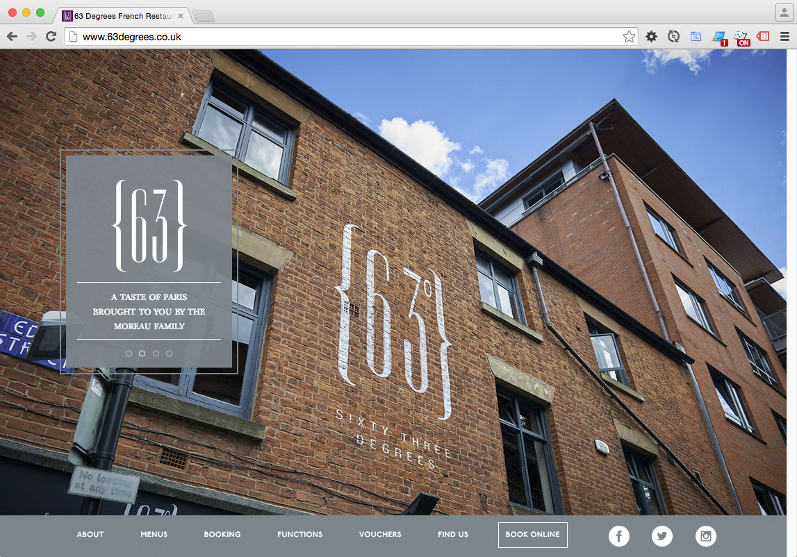
In order to give the background images on the homepage as much visual weight as possible other elements were hidden on initial load and fade in one at a time. The aim being to guide the user’s eye to the different elements at different times.
Full-size background images: Desktop vs smaller screen experience
The design features a full size background image which crossfades with 3 other images on a timer. The crossfade was built with CSS trannsitions and JavaScript (to allow the gallery to run automatically every x seconds).
Mobile page weight
To keep page weight down responsive images were used and only one image was loaded at first with JavaScript grabbing the other images after page load. Allowing for a perceived speed increased for users.
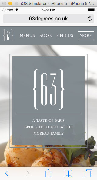
On mobile (or more specifically, screen sizes that are less than 600px in width) the automated crossfading gallery is not present. Mobile users do not need an image heavy experience they want to quickly view menus, find out the resaturant’s location and/or book.
The homepage comes in at 124Kb on mobile with only 8 requests for all assets – not bad for a site with a full size background image, Google Analytics, and two webfonts (hosted by fonts.com) it also fully loads in under 4 seconds (according to webpagetest.org) and scores 91/100 on Google Page Speed Insights – not bad for a site hosted on fasthosts.
Small-screen friendly navigation
The small-screen version of the site has a simplified menu – not a hamburger menu (which could confuse people) but rather a menu that only features the 3 core options: Menus, Booking and Location along with a more link which displays all the menu options.
Timelines:
- Project started: 29th July 2015
- Project launched: 13th August 2015
- Total FE dev time: 27 hours
Client

My role in the project: