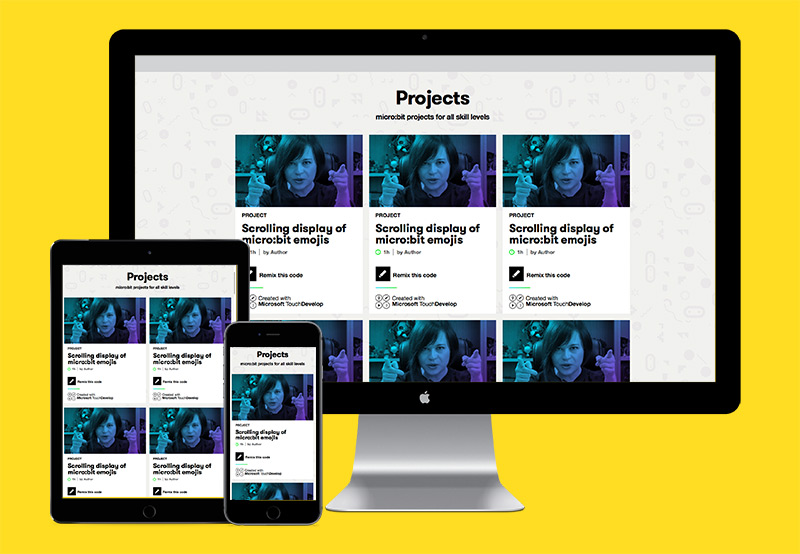
In the days before the mobile web took over, web designers slaved over PSDs for weeks then handed over 10-30 unique templates to a developer who went away and built them to pixel perfection.
Those days are gone.
There are too many unanswered questions in responsive web design and a designer sat in isolation cannot answer them all.
Introducing style guide driven design
Responsive websites can be a headache – if you decide to tweak one element that change must be tested and coded on all different screen sizes. However, by starting the designing and building of a website with a style guide (or pattern library) enables designers and developers to collaborate and avoid those headaches.
The style-guide-drive design approach allows a designer to quickly create initial elements, pass them onto the developer who turns them into HTML/CSS. In record speed we have a prototype that feels like a digital product. It’s answered questions of how will it look on an iPhone 6 Plus *and* an iPhone 4 instantly. No more assuming and no more guessing.

How to do it
Instead of creating a full page design, a designer starts with something smaller. Maybe that’s colours and typography and from there transform that into bigger component e.g. a list of products.
Once components start to be produced they can be passed on to a developer who builds them.
Designing and building one website element (e.g. the site’s masthead) at a time and testing across different devices and screen sizes before moving on to the next element (e.g. the site footer) and then fitting them all together to create individual pages at the end of the process is the best way to build a consistent product.
At first, it may feel like this approach is taking longer but the more elements are created the easier it is to build the website as a whole and to add new features.
The benefits
Fitting in with our need to speed-up websites, a style guide can standardise the CSS, keeping it small and quick to load. New members of the dev team can quickly pick-up coding styles; see whether existing modules exist and not waste time coding new elements from scratch.
As project’s evolve, a common approach to on-page problems is to design a unique solution for that specific page but with a style guide approach – a designer can see all the elements together and design as a system.
This way we avoid situations where a website has multiple different buttons styles or multiple heading sizes all of which suit a specific context, but as a whole confuse users who need to see consistency to understand your website’s interface.
Share this article
Using style guides to build better responsive websites: https://t.co/XyuPBr3f8A
— Phil Thompson (@imgiseverything) March 22, 2016