Topshop Blog
With London Fashion Week looming, Topshop wanted to update their WordPress blog for a cleaner, quicker and more on-trend design. Working with in-house designers Phil created a theme from scratch that used less plug-ins and therefore made less requests.
Topshop originally requested to use a generic theme that would be tweaked to their needs but it quickly became apparent, as with most themes, that the them they chose was woeful for performance and usability and the design changes they’d requested – although seeming simple on the surface were enough to create the same workload as creating a theme from scratch. So Phil created a bespoke theme instead and made sure performance was at the forefront.
Performance
The old site was slow which was due to a few issues:
– a large database of content
– lots and lots of images (the blog listings page contained all the content for each post on it rather than excerpts)
– mobile showed the same images as desktop
– lots of plugins all with their own JavaScript files
– social like buttons for Facebook Twitter etc
Bearing in mind the above, the previous developer had done a very good job getting the site to perform reasonably given how image and plugin heavy the site was.
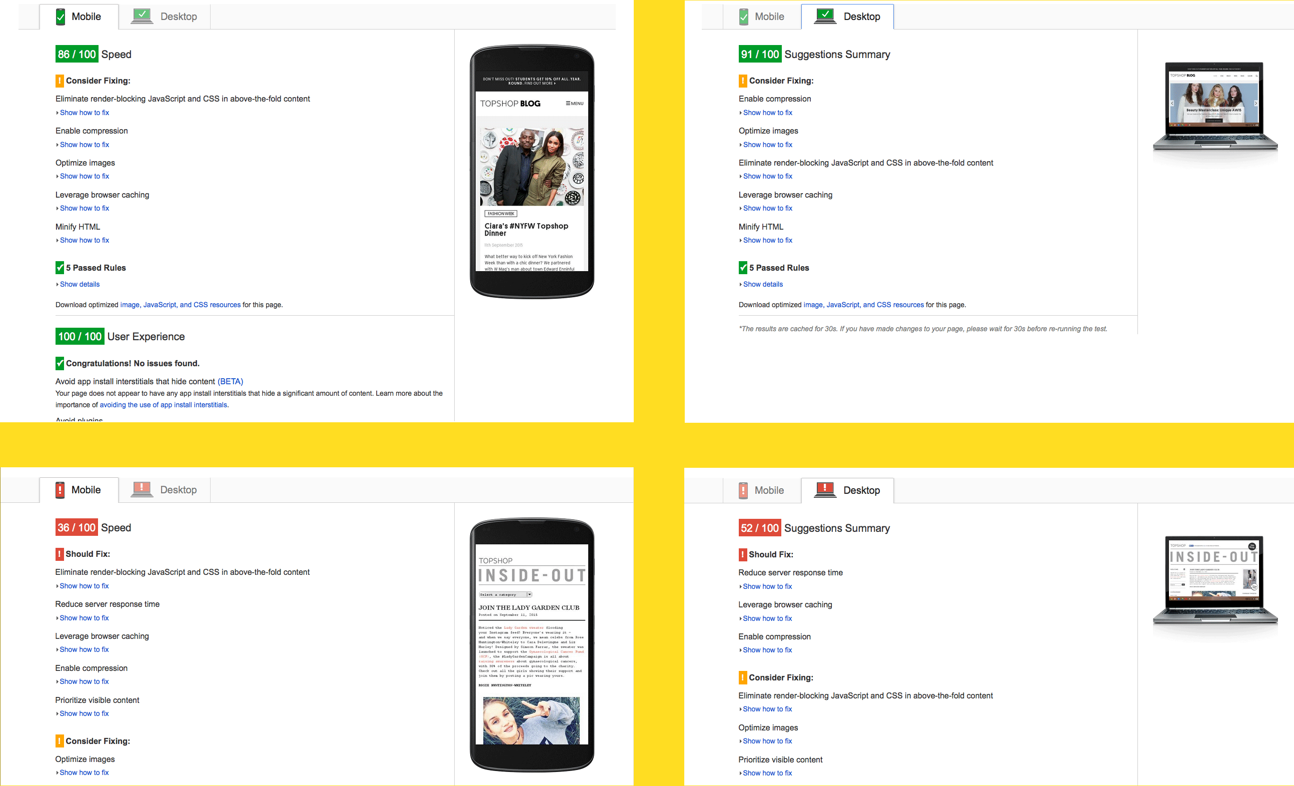
PageSpeed scores
Google PageSpeed Insights scored the new site at 91/100 for Desktop and 86/100 for Mobile compared to the old site being 52/100 for Desktop and 36/100 for Mobile.
Reduced content (and images) on home/listings pages
Step 1 was to recommend to the design team that the homepage and category/archive listings page only show excerpts of a post. This meant fewer and fewer images on the site (the site went from around ~6Mb or images to ~2.5Mb).
The old site had 90+ requests for assets and the new site has 35 requests.
Reduced plug-in reliance and social `like` plugins
Social share icons look tacky and they slow the site down a hell of a lot by loading in all their external content (HTML, CSS, JavaScript etc). So on the new site, the social share links are inline SVGs with a little JavaScript that pops open the share link in a small window.
Responsive images
mobile users may be on 3G or their local wifi – we’re never sure how fat their connection is but one thing we do know – thye do not want to download a 820px wide image on their device which is then resized to fit a 320-375px space. With the help of srcset the size of images on mobile devices was reduced by 88%! That’s right, the new home page that was 2.7Mb on a desktop device became 335Kb on screens 375px wide or less.
Timelines:
- Work started and completed: September 2015
- Project duration: 75 hours
- Website URL: http://insideout.topshop.com/
Client
My role in the project: