For the most part football (Americans, read soccer) websites are some of the worst I’ve seen from professional organisations.
The obvious reason for their appalling nature is that the people in charge have little knowledge of what makes a good information-based website. Certainly the web design agencies they hire seem to have no clue whatsoever.
Bad design, poor HTML, woeful usability
I’ve looked at the websites of the teams who finished in the top 4 of the English Premiership 2005/06. Look away now if you’re squeamish and can’t bear the site of inaccessible, poorly designed ad-fests.
Liverpool
 Splash screens only seem to prevail on UK football websites and as an occasional user of the Liverpool website, I can say first-hand how annoying it is to be greeted by a splash screen trying to sell me some debt-inducing product like an LFC credit card whenever I try to get some ticket information.
Liverpool also suffer from the dreaded drop-down menus that afflict many football websites. As the rest of the web moves away from this tripe the football clubs keep the DHTML guys rolling in cash.
Chelsea
 Talking of splash screens, Chelsea has two. One is bad enough but this is madness! When the user eventually gets to the proper homepage they are greeted with a dour light grey site that looks as though a 13 year-old has designed it, got bored half-way through leaving a 65 year-old to finish the job. Did I mention this website has a scrolling newsreel!
If you’re listening Roman, get your hand out of your pocket and pay for a good web designer.
Arsenal
 The Arsenal website is a simple little thing and better for it. I can easily imagine the Arsenal fans being happier with their site than a Chelsea supporter but it’s also a little boring-looking and quite frankly, the flashing adverts are annoying.
This site also has drop down menus but they are a combo of semantic HTML, CSS and Javascript and are therefore a lot better than Liverpool’s, but still. Arsenal is a lot better than most football site’s but is still not hitting the mark for me.
Manchester United
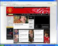
 The new Manchester United website in terms of graphic design and usability is great – it establishes the brand, the sponsors and only seems to advertise products related to MUFC in a tasteful and unobtrusive way. The information is nicely spaced out and easy to read not to mention useful to the fans.
One of the areas where it falls down is the awful URL structure. There is simply no need for a URL like this:
http://www.manutd.com/default.sps?pagegid={056D21E9-D5C6-4A89-9969-8DB08FFDE353}
Although URLs are important, it’s not the end of the world and the new site is as a whole is great. Although looking through the code, I cannot for the life of me workout why they have put the club name as a level 6 heading at the top of the body.
<div style="border-top: 0px none" class="h3title">
<h3>Top Stories</h3>
</div>
There is no place in the a website for lazy code such as that above. The designers clearly do not have a full grasp of HTML.
Summary
The moral to the story is this. With the exception of a few clubs (hello Man Utd) football websites aren’t great and you’re better checking BBC Football for your football information; it’s more frequently updated anyway.